
Project Overview
“Design a responsive online Insurance Service for Juno Insurance”
Deliverables
Responsive Website
Branding
DesignLab
UX Academy
Aicher Cohort
UX/UI Design Lead
Denise Macalino
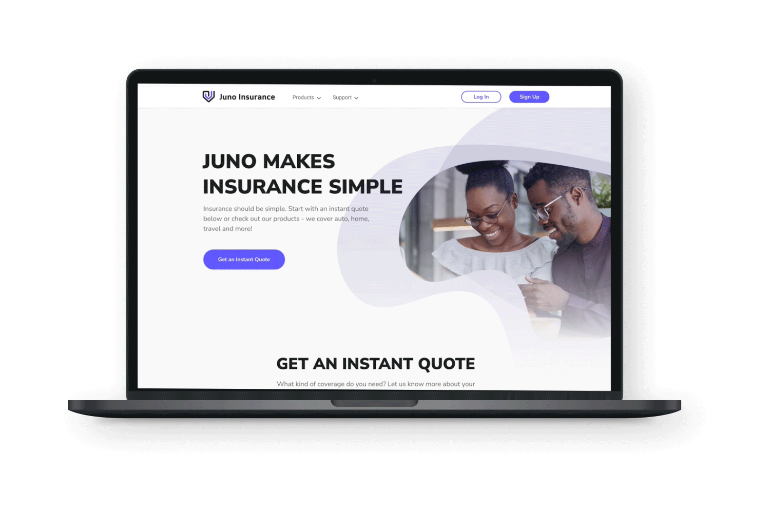
Insurance for everyday people
Juno Insurance is a long-standing and well-established insurer in Canada. Traditionally, Juno has obtained clients via regional agents. With the industry changing dramatically to meet expectations of younger owners, Juno needs to cut the middleman and connect to their customers directly. They’re a little behind in the game, so it’s of utmost importance that their online service is not only as streamlined as it can be, but that it competes with the biggest Insurers in the game.
Juno’s main USP is that they can offer more affordable packages to their customers since their insurance is pre-packaged. Especially since Juno is aiming to attract the younger generation, they wants to keep their package pricing low, and therefore optimize packages that will benefit the greatest number of people with similar situations. Additionally, Juno offers a wide range of products to meet the needs of its diverse clientele, including auto insurance, home insurance, travel insurance, and more.
Since Insurance is a complex and intimidating process, Juno’s main priority is to simplify it. Juno believes insurance should feel like a relief, not an extra stress when dealing with accidents and unprecedented events. Their insurance process needs to reflect this belief, by making sure that their insurance process is informed first and foremost by its users.
Along with an online service design, Juno will also be undergoing a rebranding to match. With a similar goal of attracting a younger target group, branding needs to feel welcoming and fresh.
Problem Statement
Great design is not about finding the right answers, but rather, on asking the right questions. The two problem statements I proposed are:
How Might We design an online insurance service that makes the process of getting insured hassle-free and streamlined?
Approach: Creating an instant quote generator that provides users the most pressing information immediately
How Might We increase trust between Juno and users getting insurance?Approach: By focusing on creating a great customer experience, free of confusion, and centred on giving value and guidance
Project Vision
“To reimagine the insurance process. Juno wants to make getting insured a streamlined process, that is inviting to new potential customers, and also builds trust between them and current customers”
Phases
First things, first - the design process! It is pretty much always a mistake to go off our first assumptions when designing solutions. That’s where a thorough design process makes all the difference between good and great design. These phases help us keep our approaches and decisions checked at several points along the journey.

Project KPI
It’s not enough to hope that our decisions are valid. We have to be able to measure their impact. Therefore, it’s essential that we think about how we’re going to measure Juno’s success. Regarding Juno’s current challenges, the most important Key Performance Indicators (KPI) will be:
Quote to Account Conversion - the most obvious indicator for success will be seeing the % of users going from getting an instant quote to deciding to purchase insurance with Juno
Customer Satisfaction - as important as the number of transactions are, in an industry like insurance, qualitative indicators are just as important. Insurance serves a need (sometimes even an obligation) rather than a desire, so t’s crucial that we see how satisfied (or unsatisfied) customers are
Project Scope
The scope of this project will be user and industry research, user experience design, prototyping and usability testing. Deliverables will include a responsive website and branding.
Phase 1 | Empathize
In this phase of the process, we’ll put aside any and all of our assumptions about the problems and challenges that might exist in the insurance process. Empathizing is all about listening - the best way to do that in this case is research - thorough, and unbiased-as-possible research.
I conducted research both to understand the market as it is today in Canada, as well as research on how people experience insurance from a user perspective. To unveil the potential areas of opportunity we may overlook, I chose research methodologies that might best inform us on the current needs we should be focusing on.
Secondary Research
Insurance is complex and confusing so let’s dissect it! First, we need to identify what questions we should know the answers to. What do insurance packages look like currently? How does the industry in Canada work currently? What are the anticipated changes to come? What are users' biggest concerns when it comes to purchasing insurance? Understanding the market to the best of our ability will also allow us to begin to understand the users we are serving.
On our journey to discovering the answers to our questions, here are my key findings:

Here is a full report on my secondary research findings for your reference
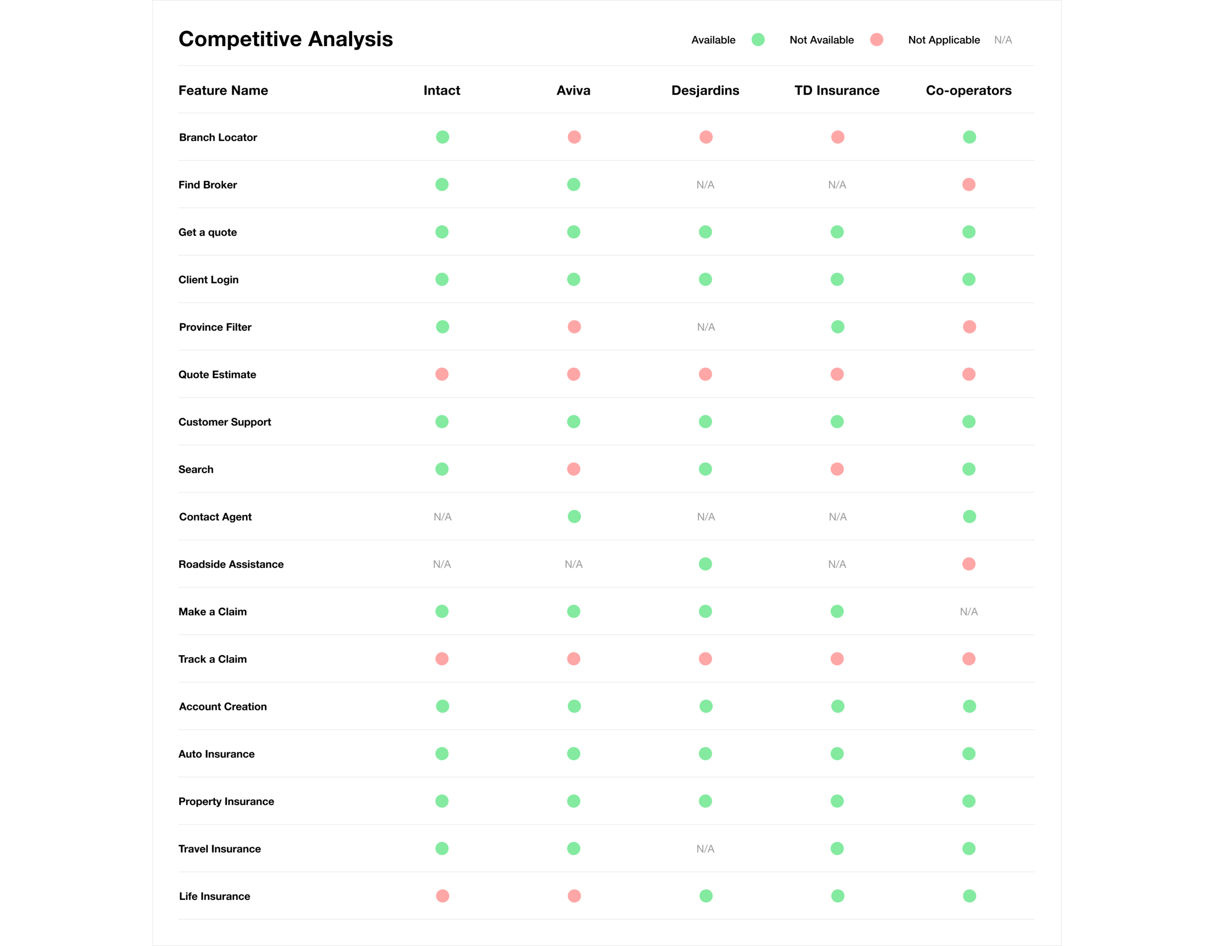
Competitive Analysis
Now that we have some preliminary information on how the insurance market looks like in Canada, we need to understand where Juno sits in the industry. The best way to do this is to look at what our competitors are doing, and how we compare. I searched the top insurers in Canada, and they were, respectively: Intact, Aviva, Desjardins, TD Insurance, and Co-operators.
I evaluated the features that were available on each to understand on a quantitative level, what is offered on each. This also gives us an insight on what the biggest players in the market deem the most important, what is deemed less important, and where we might be able to step in and provide more value.
User Interviews and SME (Subject Matter Expert Interviews)
The next step of my research was recruiting interview participants. Secondary research and competitive analysis gave us plenty of quantitative information - but to address the challenge of fostering great customer satisfaction, speaking directly to users and to subject matter experts can help us understand the things that numbers and figures can’t give us.
The first round of interviews were with users who had experience with the current process of getting insured. I wanted to understand the journey that users might expect to take in finding the best policy for them, their experiences with past and/or current online insurance services, and their motivations in finding insurance packages.
As Juno wants to attract a younger generation, I aimed to find users who were in their mid 20s - mid 30s. However, I also wanted to account for edge cases, and so, made a point to keep the ages, locations, professions and genders among participants as diverse as possible. Here are the demographics of my research participants:

As some information from these user interviews is sensitive, my folder of interview notes is private. Please request access if you’d like to see my full interview reports.
The second round of interview, I conducted Subject Matter Expert (SME) Interviews. I interviewed 2 individuals who worked in the industry. The first participant was in her late 20s, and was working as an Auto Claims Adjuster. The second participant was in her mid 50s and had been working as an Insurance Analyst for 9 years.
Again, since some information from these SME interviews is sensitive, my folder of interview notes is private. Please request access if you’d like to see my full interview reports.
Some of my main findings from these interviews were:
Proactivity | Insurance agents believe users can be proactive via knowing their rights
User Insights | There are more claims overall from inner-city residents than in suburbs. There has also been a rise in injury and medical services being requested
Overall Process | Talking to an agent over the phone primarily for everything from quotes to claims is still the norm
High-level Goals | Users want to feel taken care of. They want to be financially comfortable while meeting their lifestyle desires
Archetypes | From the 6 interviews conducted, 3 archetypes stood out: Budgeters, Cautious Researchers, First-time Owners
Affinity Diagram | The common themes among participant interview answers were: brand comparison, service experience, and risk assessment
Expertise | Knowledge on insurance varies widely across genders and ages, but overall, insurance knowledge is pretty low
Pains | Sometimes users deal with poor customer service. Most feel the process overall, however, is straight-forward. Price is the main pain point
Expectations | Quotes need to be received within a day, and it shouldn’t take longer than that to set up monthly payments
After conducting secondary research, competitive analysis, user and SME interviews, it’s time to find the common themes and highlight them.

Here is a full summary of my research findings
Informed by our methodologies, we can now start to speculate 1. Who we are designing 2. What their needs are and 3. How we can meet those needs.
Creating a User Persona | Who are we designing for?
One of the main benefits of conducting interviews with potential users is to help us really personify the people we are designing for. So, first, I wrote down the high-level goals from my user interviews, and pulled 3 potential goals-based personas from this. They were: the budgeter, the researcher, and first-time owner. Since Juno wants to attract younger customers, and my interviews revealed that first-time owners were in the younger bracket, the target group that made the most sense to have in mind was the first-time owner.
I then wrote down the quotes from my interviews with these individuals that stood out to me. I categorized these quotes and pulled the common themes: brand comparison, customer experience, and risk assessment. I formulated the common pain points and goals/motivations to create a story and Juno’s target persona: Hassan Sajid.

This persona will allow us to ensure that our user is always at the centre of our design decisions. Having this to draw on will guide us to take informed approaches.
Empathy Map | What are their needs?
To further personify our user, and put ourselves in their shoes, we need to make them a fully formed individual with thoughts, actions, feelings, experiences, motivations, and challenges. A great way to do this and stay human-centred in our approach is creating an empathy map. This is a tool to help us brainstorm what they are experiencing, and how that influences them within the process of getting insured.

Phase 2 | Define
Now that we’ve conducted thorough research on the Insurance Industry and user behaviours/expectations in getting insured, we can begin synthesizing our findings. Let’s first answer: How might we meet those needs? What might meeting those needs look like? Defining what our next steps should be will give us a preliminary blueprint of our design approach.
Project Goals | How can we meet those needs?
Part of product design is addressing the reality that all stakeholders - users, designers/engineers, and the business as a whole have goals. These goals don’t live in a vacuum, however, and it’s important to see where there is overlap. Keeping these goals in mind will help in the next step of choosing features, but also further down the road when checking our assumptions about potential solutions.

Feature Roadmap
Next, we need a checklist of the features that we will have on Juno’s website to have a birds-eye view of everything that we can offer within the design. These features need to be informed by our project goals, as well as the empathy map we created earlier. I’ve also drawn on my competitive analysis to understand how to prioritize the features that will be part of the design. This will ensure we aren’t making arbitrary decisions when it comes to adding features.

Information Architecture | Sitemap
The final stage in the Define Phase is Information Architecture or IA.
Information Architecture “focuses on organizing, structuring, and labelling content in an effective and sustainable way”. It’s how we can start to think, from a high-level point of view
This is how we can first try and organize Juno’s flow by creating a sitemap. We have an idea of who are target user is, their needs and motivations, and now a thorough list of needed features. To consolidate this and make it clear through a sitemap.
I also conducted 2 card sorts, so that I could best understand how to organize 1. the different features, and 2. The different insurance categories. Here are the results from my Feature Card Sort and the results for my Insurance Products Card Sort
It took me 5 iterations to get to this version, and in the end is the one that best spoke to the pain point about research fatigue. This sitemap is designed to allow users to input information and get a suggested quote based on that information.

Phase 3 | Ideation
Once finalizing the Information Architecture is complete, we can start to ideate the design of the system in greater detail. Before getting into any low fidelity sketches, it’s important to verify that the flow of Juno’s service makes sense. We can do this by creating a task flow, followed by an even more detailed, flowchart. These will help us understand the journey that a user would take while using Juno. It also allows us to catch any flaws in the flow early on.
Task Flow
This task flow is a preliminary estimate of how our users might approach using Juno’s service. Although it can’t answer usability immediately, it will help us make sure that there aren’t any major issues in the flow early on.

Flow Chart
After workshopping a few iterations of the task flow above, I was able to move forward and formulate an even more detailed journey through a flowchart. This chart should encompass any journey a user might take, and all points should lead to the checkout page.

Sketches
After completing the Information Architecture stage, I started by getting initial ideas out onto paper. Starting with lo-fidelity wireframes on paper is a great way to 1. get design ideas out as soon as possible and prevent blocking creative solutions, and 2. allow us to stay open-minded and not commit to any ideas by investing too early in a higher fidelity version. Here are the initial sketches for Juno:

Mid-fidelity Wireframes
Once confirming that the sketches covered the most important needs, and followed the defined flow from our flowchart, I went ahead and took the designs a step further with mid-fi wireframes. This version will allow us to begin prototyping and also give us a real sense of what our design approach will look like. These were fully responsive wireframes. If you’d like to see the complete set of wireframes, you can check them out here.

Desktop Wireframes

Mobile Wireframes
Mid-fidelity Prototyping
As always, we should never assume that our solution makes sense - thus, prototyping! Prototyping early on is one of the more important lessons this case study gave me. After prototyping the mid-fidelity version there were some high-level issues that were good to catch before working any further on wireframes.
I tested the mid-fidelity prototype with 3 participants. 2 Males and a Female, whose ages ranged from 24 - 35. A few problems came to light:
1. The instant quote form asks for too much sensitive information. When just getting a quote, users don’t expect to need to give their address or their name and email address, VIN number, and license number. This problem would decrease and not increase trust, which is the opposite of our goal.
Approach: To address the problem of asking for too much sensitive information, I decided that
address and name information needed to be reserved for only the checkout process.
However, this meant that the questions in the checkout process would be redundant, so
we removed the questions that existed in the instant quote form from the checkout
process. The quote form would instead ask simply for city, province, and postal code.
All other questions were moved to the checkout.

Before and After in Tablet Version
2. No one used the CTAs for the insurance package categories. The extra CTAs added unnecessary cognitive overload and none of the usability participants used it. All of them used the cards when clicking for more information.
Approach: In order to reduce the busyness on the page it became necessary to remove the CTAs below the category cards. As a solution, I left only the cards, allowing affordance in a simpler and also more aesthetically pleasing way.

Before and After in Tablet Version
3. Too many steps to see insurance package details, which deters users from being able to check for more information. In order to see more information on basic car insurance (or any specific category for that matter) users were brought to another page entirely, which was too many steps to navigate back from.
Approach: My approach to reducing the number of full pages that users were brought to, I opted for a different design pattern. Rather than a separate page for a package, which users would have to navigate back from, I created a pop-up of information.

Before and After in Desktop Version
User Interface (UI)
Now that we’ve identified the preliminary issues in the mid-fidelity prototyping, we can start to work on the user interface! Here, we take our wireframes, and take on the visual side. This step is important to get right and keep in line with Juno’s branding. I ended up going for 2 different design directions, which took considerate time and feedback and going back to the drawing board. The first version (pictured left) uses a purple monochromatic colour scheme with modern illustrations. The second version (pictured right) uses photos of real people, and uses a muted tetradic colour scheme. Both achieve a welcoming and inviting brand, however the first one feels younger and the second one feels more professional.

Left: Version 1 | Right: Version 2
The Case Against Faceless Illustrations
I was quite torn between the two directions. On one hand I loved the feel of the first version, with the soft lines and the modern look with the illustrations. On the other hand, I liked the professional look and the use of real photos in the second version.
After speaking to a few UX Designers, I decided against the faceless illustrations. In one group critique, a designer mentioned to me that there are actually a lot of ethical issues with using these faceless illustrations. For one, they are way over-used in the tech world, and make Juno look more like a start-up - which is not what it is. For another issue, faceless illustrations erase identity, race, and individuality. It is a way to ignore using representation. As someone who cares deeply about inclusivity and representation, I decided that the illustrations weren’t the right direction in the end. If you’re curious to learn more about the issues that come with using these stock illustrations, here is one article by AirBnb about their attempt to use more ethical illustrations, and here is an article about tech’s use of these questionable illustrations.
Final UI Kit
In the end, I decided to take elements from both directions, and make them one! And it was the best of both worlds. I wanted to utilize photos of real people, because on the level of empathy, they are relatable, a lot more inclusive, and evoke emotions. However, I really loved the colour scheme of the first version, as it’s really modern and appeals to the younger target group that Juno wanted to attract. So if both versions had a baby in the form of a UI Kit, this is what it would look like:

Final UI Kit
Phase 4 | Prototype
After finally confirming our final UI Kit, I created the first iteration of the hi-fidelity wireframes. The wireframes covered the journey we determined in our flowchart. Here is the prototype in action! If you want to walk through the prototype yourself, click for the full version here
Prototype
Phase 5 | Testing
It’s all well and good to have beautiful hi-fi wireframes, but they aren’t useful if you can’t test them and verify that they actually work. So that leads us to one of the most important parts of UX Design - testing! Just like we did with our mid-fidelity versions, we will test our hi-fi versions to test how the real product might work IRL.
Demographics
I recruited 5 test participants. 3 Males, 2 Females between the ages of 24 and 60. 2 participants were based in the US, 3 were based in Canada. 3 were first-time owners, and varied from low to high tech-savviness.

Usability Test Participant Demographics
Based on Juno’s main goal of making the insurance process seamless, the steps that made the most sense in this flow were: finding insurance, getting a quote, and then getting insured. This helped determine what scenarios and tasks we would give our usability participants.
Below is a detailed view of the usability testing plan.

Usability Test Plan

Usability Testing Script
Observations | Affinity Diagram
After conducting all the usability tests, I noted the common themes and observations, then created an Affinity Diagram. This diagram makes the information more digestible, and allows us to prioritize the problems that need the most attention.

Affinity Diagram
Final Revisions
Based on our usability test findings, we can move forward with the next steps. Although we can now confirm that the overall flow makes sense, there were a few small things that need iterations.
Some of the smaller changes were: making the filled field forms more distinct from the unfilled fields, as a few users didn’t know that the fields weren’t already filled. This was fixed by simply making the filled field text a black (#22222) rather than a dark gray (#737373). Another small change was making the CTA on the header section “Get a Quote”, rather than “Explore Our Products”, as some users mentioned that they believed that was the main point of an insurance service. Furthermore, no users actually used the “Explore Products” CTA, so its value was questionable.
As for bigger and more consequential changes, there were 3 in particular that needed attention. The final version changes are as follows:
1. Tab Menu vs Pop.Up
Users expected the package information to be available to them as soon as they clicked one of the product categories. Even though the pop-up took away the step of loading a full new page, it was still an extra step that users did not want to have to take. To make it even simpler, I referred to the design patterns that used a menu tab. This way the information would be available immediately, and would make getting a quote even more enticing.

Left: Pop up (V1) | Right: Tab Menu (V2)
2. More apparent hover status
When testing with older participants, or participants with visual impairment, the hover status on the quote form, and on cards was too subtle. On the first hi-fi version, the hover status was a 1x stroke outline of the brand colour, but some users didn’t know they were hovering immediately. Therefore, I made the 1x stroke outline the selection status, and a light purple overlay the hover status - this is also a more familiar design pattern.

Left: Stroke hover status | Low opacity brand colour hover status
3. More enticing USP
The homepage should not just make the insurance process feel simple, but should have a real competitive USP. One user noted that they would be more inclined to get insurance with Juno if the Claims section of the homepage ensured users that they would get their claims paid out, rather than that they could make a claim on their phone. It’s a small change in some ways, but may have a big impact for conversion.

Left: Version 1 USP | Right: Version 2 USP
Final Version
And finally, here is our version post-usability test changes! This version addresses the most important problems: 1. streamlining the insurance process, 2. reduce the research time for choosing insurance, and 3. building trust. Here is the full prototype for your reference!


Reflection
Creating a responsive online service for insurance was a welcome challenge. Starting from knowing virtually nothing about insurance to creating a journey addressing a pain point in the industry was a great learning experience.
Researching extensively and working directly with people was not only fun, but so mind-opening. It was a good reminder as a designer that our assumptions are pretty much always that - assumptions. The chance to see how important testing and iterating is with Juno’s website was in making a truly empathetic product was invaluable.